Laravel Jetstream with TailwindUI
👉 I am writing this quick guide to show how to setup a new Laravel Jetstream(Inertia) application with TailwindUI, including HeadlessUI and Heroicons.
Laravel
There are many guides so I am not going into detail here.
laravel new tailwindUI --jet --stack inertia -q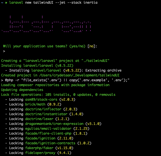
Navigate to the directory
cd tailwindUI
Create a database(as needed) and migrate
mysql -u root <<-EOF
CREATE DATABASE tailwindUI;
EOF

php artisan migrate
Next, lets run npm
npm install && npm run dev
Lastly lets migrate and open the new project in the browser
(This assumes you are using MacOS and Valet, see the Laravel Valet docs for more.)
valet link
valet open
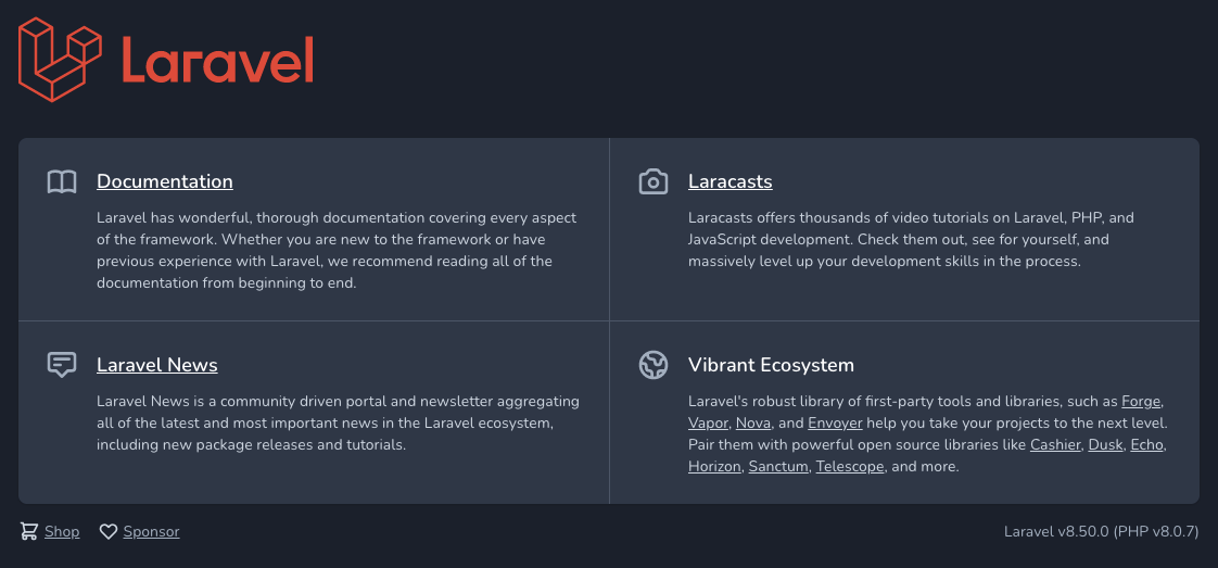
Done.
TailwindUI
Install dependencies
Jetstream is designed using Tailwind CSS which comes pre-installed, however Tailwind UI for Vue depends on Headless UI to power all of the interactive behaviour and Heroicons for icons, so we'll need to add these two libraries to your project:
npm install @headlessui/vue @heroicons/vue🚨 These libraries and Tailwind UI itself all require Vue 3+.
run the dev build:
npm run dev
First-party plugins
TailwindUI rely on the default Tailwind CSS v2.0 configuration, but some components rely on additional first-party plugins like @tailwindcss/forms, @tailwindcss/typography, and @tailwindcss/aspect-ratio.
When a component requires any plugins or configuration changes, it will be noted in a comment at the top of the example, for example:
<!--
  This example requires Tailwind CSS v2.0+

  This example requires some changes to your config:

  ```
  // tailwind.config.js
  module.exports = {
    // ...
    plugins: [
      // ...
      require('@tailwindcss/forms'),
    ]
  }
  ```
-->
<div>
  <label for="email" class="block text-sm font-medium text-gray-700">Email</label>
  <div class="mt-1">
    <input type="text" name="email" id="email" class="shadow-sm focus:ring-indigo-500 focus:border-indigo-500 block w-full sm:text-sm border-gray-300 rounded-md" placeholder="you@example.com">
  </div>
</div>
When a first-party plugin is required they can be added using the npm install command
npm install @tailwindcss/forms @tailwindcss/typography @tailwindcss/aspect-ratio
Then enabled by adding them to the tailwind.config.js file:
// tailwind.config.js
module.exports = {
  // ...
  plugins: [
    require('@tailwindcss/forms'),
    require('@tailwindcss/typography'),
    require('@tailwindcss/aspect-ratio'),
  ]
}
Fonts
Fonts can be imported in the resources/css/app.css file as follow:
@import url('https://rsms.me/inter/inter.css');and then enabled in the tailwind.config.js file as follow:
module.exports = {
    // ...

    theme: {
        extend: {
            fontFamily: {
                sans: ['Inter var', ...defaultTheme.fontFamily.sans],
            },
        },
    },

    // ..
};
Welcome - Route::get('/example')
We will create an example route to render an example Inertia page atresources/js/pages/Example.vue.
This welcome view is reached by defining the route in routes/web.php as follow:
Route::get('/example', function () {
    return Inertia::render('Example');
});
Because Laravel Jetstream bootstraps Inertia/Vue all we have to do is update or create the Example.vue file with the content.
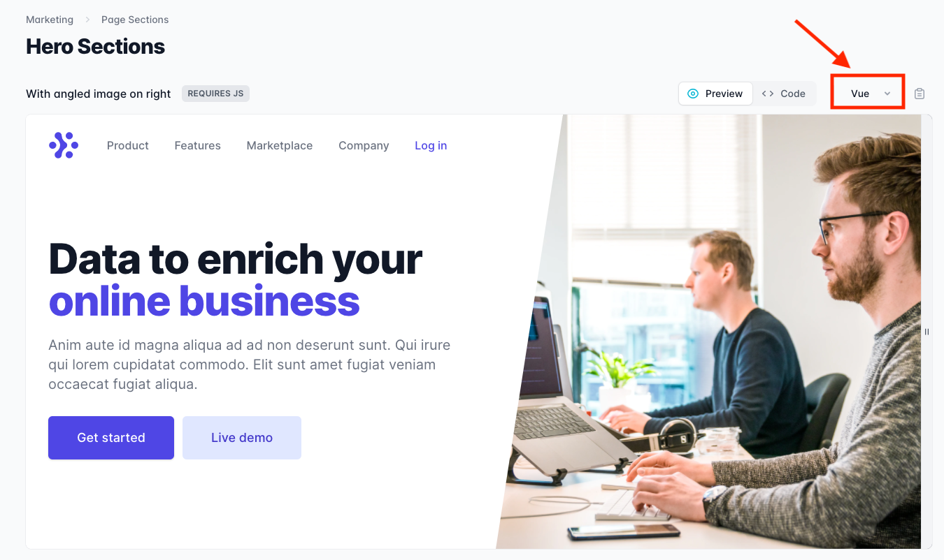
We will use the TailwindUI Hero Section example component. Be sure to select the Vue option and then copy the component using the clipboard b
<!-- This example requires Tailwind CSS v2.0+ -->
<template>
  <div class="relative bg-white overflow-hidden">
    <div class="max-w-7xl mx-auto">
      <div class="relative z-10 pb-8 bg-white sm:pb-16 md:pb-20 lg:max-w-2xl lg:w-full lg:pb-28 xl:pb-32">
        <svg class="hidden lg:block absolute right-0 inset-y-0 h-full w-48 text-white transform translate-x-1/2" fill="currentColor" viewBox="0 0 100 100" preserveAspectRatio="none" aria-hidden="true">
          <polygon points="50,0 100,0 50,100 0,100" />
        </svg>

        <Popover>
          <div class="relative pt-6 px-4 sm:px-6 lg:px-8">
            <nav class="relative flex items-center justify-between sm:h-10 lg:justify-start" aria-label="Global">
              <div class="flex items-center flex-grow flex-shrink-0 lg:flex-grow-0">
                <div class="flex items-center justify-between w-full md:w-auto">
                  <a href="#">
                    <span class="sr-only">Workflow</span>
                    <img class="h-8 w-auto sm:h-10" src="https://tailwindui.com/img/logos/workflow-mark-indigo-600.svg" />
                  </a>
                  <div class="-mr-2 flex items-center md:hidden">
                    <PopoverButton class="bg-white rounded-md p-2 inline-flex items-center justify-center text-gray-400 hover:text-gray-500 hover:bg-gray-100 focus:outline-none focus:ring-2 focus:ring-inset focus:ring-indigo-500">
                      <span class="sr-only">Open main menu</span>
                      <MenuIcon class="h-6 w-6" aria-hidden="true" />
                    </PopoverButton>
                  </div>
                </div>
              </div>
              <div class="hidden md:block md:ml-10 md:pr-4 md:space-x-8">
                <a v-for="item in navigation" :key="item.name" :href="item.href" class="font-medium text-gray-500 hover:text-gray-900">{{ item.name }}</a>
                <a href="#" class="font-medium text-indigo-600 hover:text-indigo-500">Log in</a>
              </div>
            </nav>
          </div>

          <transition enter-active-class="duration-150 ease-out" enter-from-class="opacity-0 scale-95" enter-to-class="opacity-100 scale-100" leave-active-class="duration-100 ease-in" leave-from-class="opacity-100 scale-100" leave-to-class="opacity-0 scale-95">
            <PopoverPanel focus class="absolute top-0 inset-x-0 p-2 transition transform origin-top-right md:hidden">
              <div class="rounded-lg shadow-md bg-white ring-1 ring-black ring-opacity-5 overflow-hidden">
                <div class="px-5 pt-4 flex items-center justify-between">
                  <div>
                    <img class="h-8 w-auto" src="https://tailwindui.com/img/logos/workflow-mark-indigo-600.svg" alt="" />
                  </div>
                  <div class="-mr-2">
                    <PopoverButton class="bg-white rounded-md p-2 inline-flex items-center justify-center text-gray-400 hover:text-gray-500 hover:bg-gray-100 focus:outline-none focus:ring-2 focus:ring-inset focus:ring-indigo-500">
                      <span class="sr-only">Close main menu</span>
                      <XIcon class="h-6 w-6" aria-hidden="true" />
                    </PopoverButton>
                  </div>
                </div>
                <div class="px-2 pt-2 pb-3 space-y-1">
                  <a v-for="item in navigation" :key="item.name" :href="item.href" class="block px-3 py-2 rounded-md text-base font-medium text-gray-700 hover:text-gray-900 hover:bg-gray-50">{{ item.name }}</a>
                </div>
                <a href="#" class="block w-full px-5 py-3 text-center font-medium text-indigo-600 bg-gray-50 hover:bg-gray-100">
                  Log in
                </a>
              </div>
            </PopoverPanel>
          </transition>
        </Popover>

        <main class="mt-10 mx-auto max-w-7xl px-4 sm:mt-12 sm:px-6 md:mt-16 lg:mt-20 lg:px-8 xl:mt-28">
          <div class="sm:text-center lg:text-left">
            <h1 class="text-4xl tracking-tight font-extrabold text-gray-900 sm:text-5xl md:text-6xl">
              <span class="block xl:inline">Data to enrich your</span>
              {{ ' ' }}
              <span class="block text-indigo-600 xl:inline">online business</span>
            </h1>
            <p class="mt-3 text-base text-gray-500 sm:mt-5 sm:text-lg sm:max-w-xl sm:mx-auto md:mt-5 md:text-xl lg:mx-0">
              Anim aute id magna aliqua ad ad non deserunt sunt. Qui irure qui lorem cupidatat commodo. Elit sunt amet fugiat veniam occaecat fugiat aliqua.
            </p>
            <div class="mt-5 sm:mt-8 sm:flex sm:justify-center lg:justify-start">
              <div class="rounded-md shadow">
                <a href="#" class="w-full flex items-center justify-center px-8 py-3 border border-transparent text-base font-medium rounded-md text-white bg-indigo-600 hover:bg-indigo-700 md:py-4 md:text-lg md:px-10">
                  Get started
                </a>
              </div>
              <div class="mt-3 sm:mt-0 sm:ml-3">
                <a href="#" class="w-full flex items-center justify-center px-8 py-3 border border-transparent text-base font-medium rounded-md text-indigo-700 bg-indigo-100 hover:bg-indigo-200 md:py-4 md:text-lg md:px-10">
                  Live demo
                </a>
              </div>
            </div>
          </div>
        </main>
      </div>
    </div>
    <div class="lg:absolute lg:inset-y-0 lg:right-0 lg:w-1/2">
      <img class="h-56 w-full object-cover sm:h-72 md:h-96 lg:w-full lg:h-full" src="https://images.unsplash.com/photo-1551434678-e076c223a692?ixlib=rb-1.2.1&ixid=eyJhcHBfaWQiOjEyMDd9&auto=format&fit=crop&w=2850&q=80" alt="" />
    </div>
  </div>
</template>

<script>
import { Popover, PopoverButton, PopoverPanel } from '@headlessui/vue'
import { MenuIcon, XIcon } from '@heroicons/vue/outline'

const navigation = [
  { name: 'Product', href: '#' },
  { name: 'Features', href: '#' },
  { name: 'Marketplace', href: '#' },
  { name: 'Company', href: '#' },
]

export default {
  components: {
    Popover,
    PopoverButton,
    PopoverPanel,
    MenuIcon,
    XIcon,
  },
  setup() {
    return {
      navigation,
    }
  },
}
</script>
We can then run the watcher, npm run watch, and view the example page using the defined route.

Enjoyed the post and you'd like to receive the next article in your inbox? Sign up to my newsletter (if you haven't already).
Psssst, worried about sharing your email address and would rather want to hide it? Consider using a service I created to help with that: mailphantom.io
Also, if you have any questions, comments, or suggestions please feel free to Contact Me.